Note
Go to the end to download the full example code.
Basic Data Visualization#
This example demonstrates creating basic plots with interactive elements that will work both in the static Gallery view and when launched in Marimo.
Interactive version available via 'launch marimo' button!
import matplotlib.pyplot as plt
import numpy as np
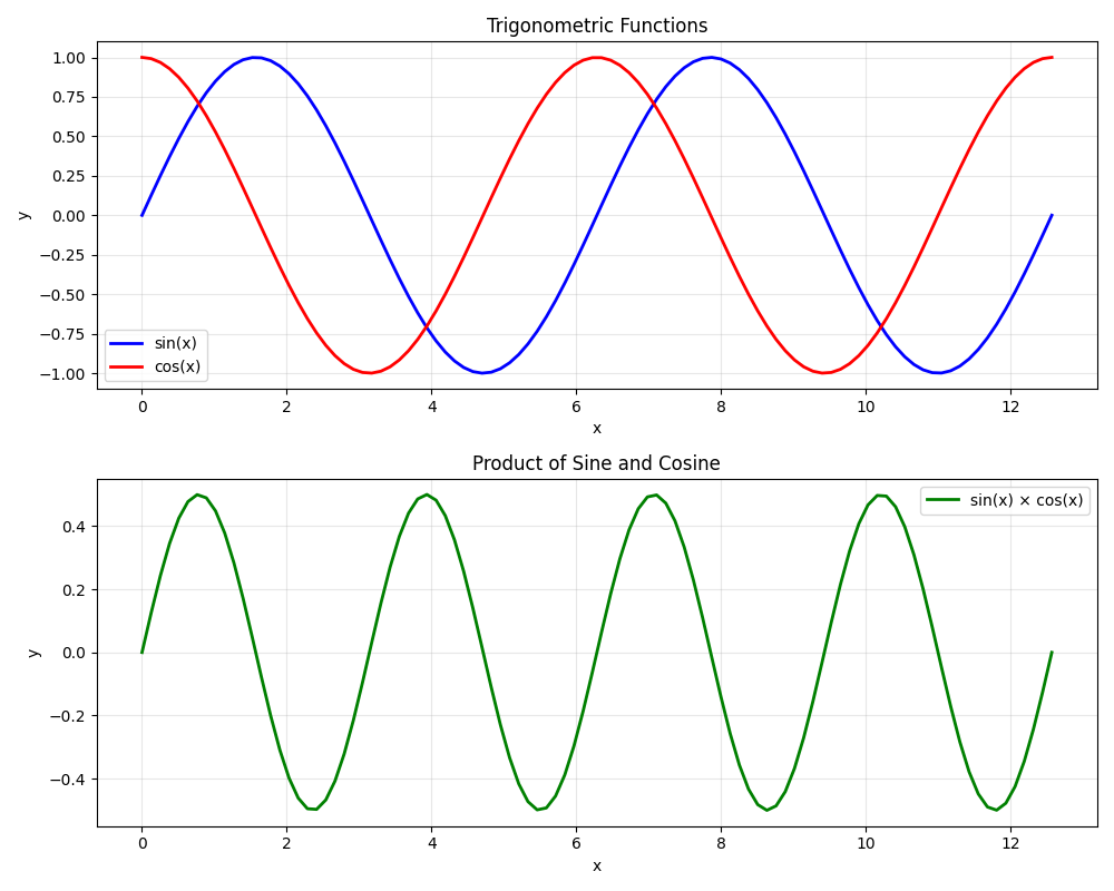
# Create data
x = np.linspace(0, 4 * np.pi, 100)
y1 = np.sin(x)
y2 = np.cos(x)
y3 = np.sin(x) * np.cos(x)
# Create the plot
fig, (ax1, ax2) = plt.subplots(2, 1, figsize=(10, 8))
# First subplot - sine and cosine
ax1.plot(x, y1, 'b-', linewidth=2, label='sin(x)')
ax1.plot(x, y2, 'r-', linewidth=2, label='cos(x)')
ax1.set_title('Trigonometric Functions')
ax1.set_xlabel('x')
ax1.set_ylabel('y')
ax1.legend()
ax1.grid(True, alpha=0.3)
# Second subplot - product
ax2.plot(x, y3, 'g-', linewidth=2, label='sin(x) × cos(x)')
ax2.set_title('Product of Sine and Cosine')
ax2.set_xlabel('x')
ax2.set_ylabel('y')
ax2.legend()
ax2.grid(True, alpha=0.3)
plt.tight_layout()
plt.show()
# When this runs in Marimo, users could add interactive sliders to control
# frequency, amplitude, or phase of the waves
print("Interactive version available via 'launch marimo' button!")
Total running time of the script: (0 minutes 0.196 seconds)